Data Wrangling and Exploration
In this post, we are going to look at how to do Data Wrangling by using Python Pandas library in Jupyter, and for data visualisations we will go through by using Tableau Public.
The data set we are going to use is that recorded Coral Bleaching data for 8 different sites in the Great Barrier Reef (the Data set is given by Queensland in northeastern Australia). The data contains percentages of each different kinds of coral bleaching; hard corals, sea pens, blue corals, soft corals and sea fans over the last 8 years, site which indicates coral’s location.
With this data, we will answer these two following questions:
1. In which years and for which kinds of coral bleaching is the worst.
2. How the location of the site affects bleaching on the different kinds of coral.
In this task we are going to look at how to do Data Wrangling by using Python Pandas library in Jupyter, and for data visualisations we will go through by using Tableau Public.
The data set we are going to use is that recorded Coral Bleaching data for 8 different sites in the Great Barrier Reef (the Data set is given by Queensland in northeastern Australia). The data contains percentages of each different kinds of coral bleaching; hard corals, sea pens, blue corals, soft corals and sea fans over the last 8 years, site which indicates coral’s location.
With this data, we will answer these two following questions:
Before we are answering the two questions mentioned early, we will do data cleaning and reformatting.
1. Data Wrangling
1.1 Data Transformation
A range of the initial data source contains 8 rows; 8 sites, and 42 columns that shows longitude, latitude, and 8 years into five different kinds of corals. We transformed the initial data source into 6 columns; Name, Longitude, Latitude, Year, Species, and Bleaching by using python. In Figure 1, we compared with the two data tables; initial data set and the data table after data transforming.

<Figure 1: Left: Initial data before transformation, Right: Transformed data>
1.2 Data Checking
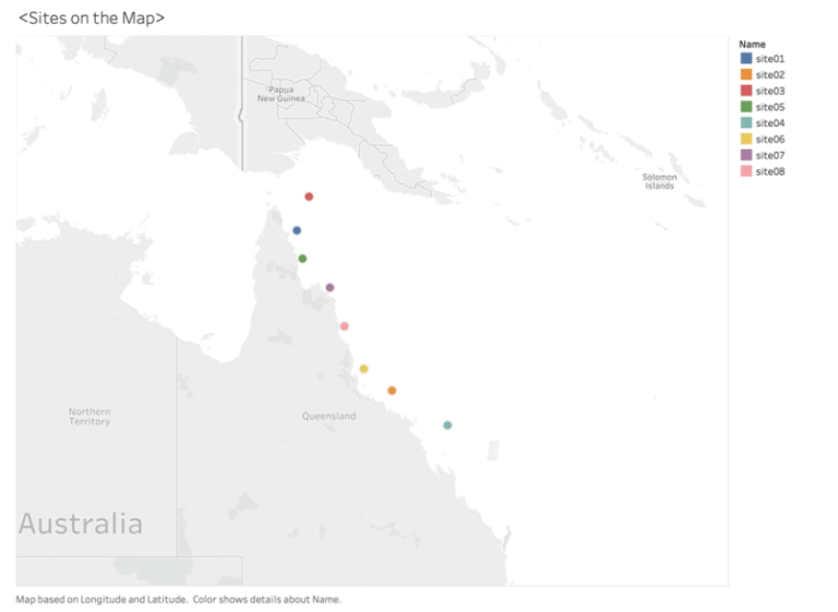
After we modified site02 latitude, the site02 stated in the line of the Great Barrier Reef area.
1.2.1 Wrong format latitude
As Figure 2 shows, only Site02 is located out of the Great Barrier Reef area. According to comparing latitude with other sites, only Site02 was positive latitude, thus we decided to changed latitude into negative value.
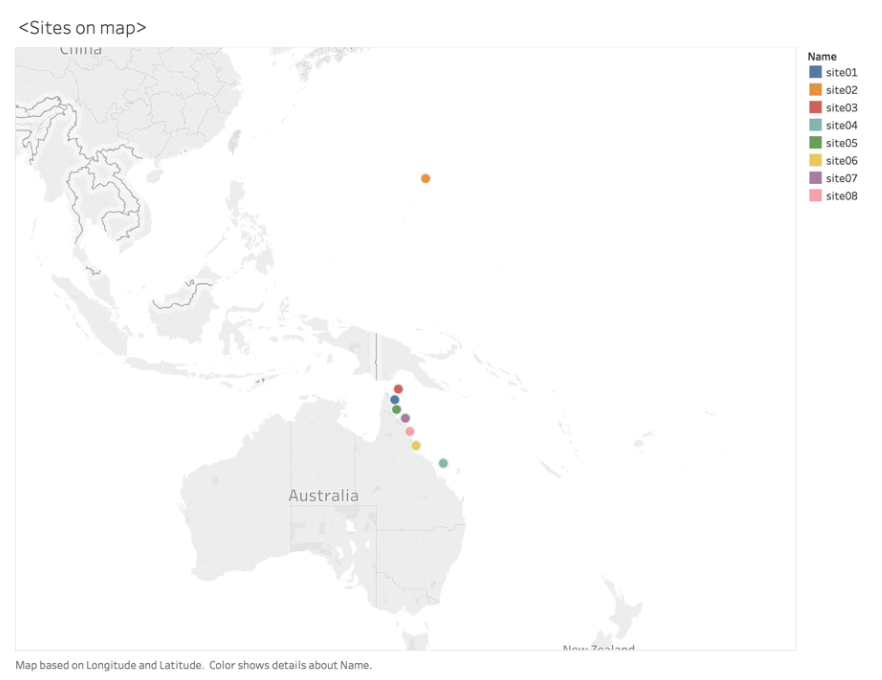
After we modified site02 latitude, the site02 stated in the line of the Great Barrier Reef area.
1.2.2 Outlier bleaching
The initial data source presents the percentage (%) of bleaching for different kind of corals. A range of bleaching must be less than 1.0 which is 100%. We examined the range of bleaching values in Tableau by sorting descending order, and we found there is one-row shows outrange as 1.488 bleaching.

<Figure 4: Checking outlier of bleaching area>
1.3 Replace missing Data
1.3.1 Missing data
We found that there are 75 missing values in a bleaching column.
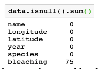
After examining missing values in a bleaching column, we decided to fill the missing values into average value. We used group by function to get the average of each bleaching values from the different kinds of corals. In python, we grouped by Name and Species, and apply mean function to get average of each bleaching in different kind of Corals. For example, site03, in figure shows left side is Null values in site0 and at the right side is output of group by. The green arrows in the picture shows replace values at the missing values.
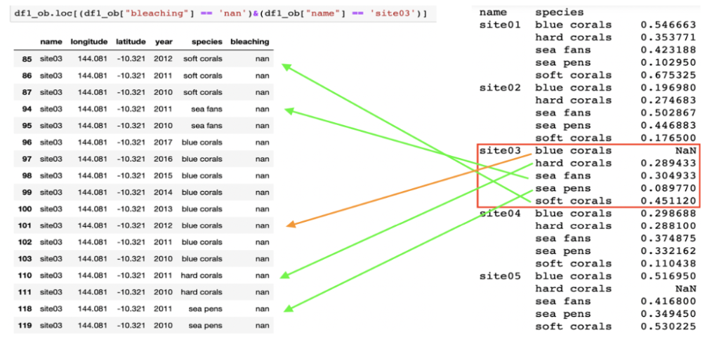
After replacing null values into average value, there were still 40 missing values in site03, site05, site06 and site07 rows. We determined to impute those missing values to average bleaching value from their closer site. We examined each site’s distance by looking at the sites on a geography map and found that site03 and site05 are closest to site01, site06 is located nearby site02, and site07 is close to site05. Then we replaced the remained missing value based on the mean values of each site.
2. Data Exploration
1.3.1 Missing data
Now, with the cleaned data, we will answer the two given following questions by visualising based on the wrangled data.
Q1) In which years and for which kinds of coral bleaching is the worst? Answer: Sea fans is the worst in 2017.
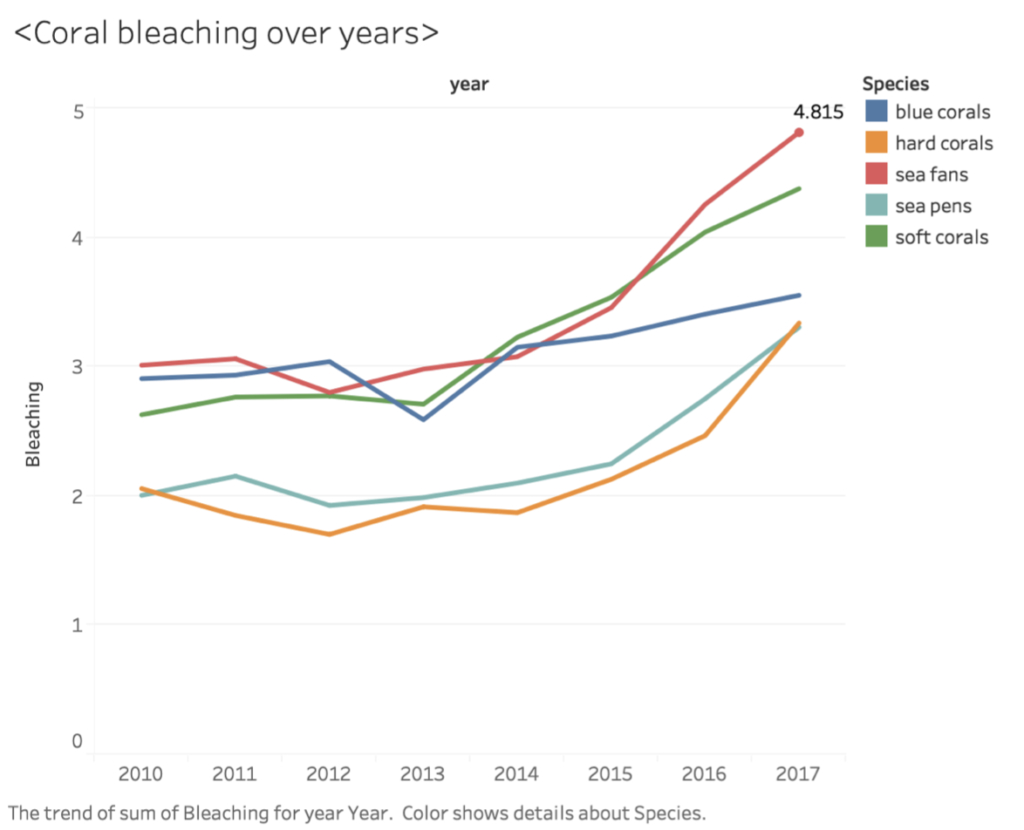
<Figure 7: Coral bleaching over 8 years>
As Figure 7 displays that the bleaching rate of sea fans was the highest bleach range as its 48 %. The Figure 7 graph is explored based on data where the missing values were replaced by the mean bleaching % of corals grouped by species and site.
Q2) How the location of the site affects bleaching on the different kinds of coral. Answer: The site03 which is at the northeast side, affects bleaching on Blue Corals. Site01, Site05, Site07 and Site08 which is near to land affects bleaching on Soft Corals. Lastly, Site06, Site02 and Site04 which is towards the southeast side, affects bleaching on Sea fans.Circle colour
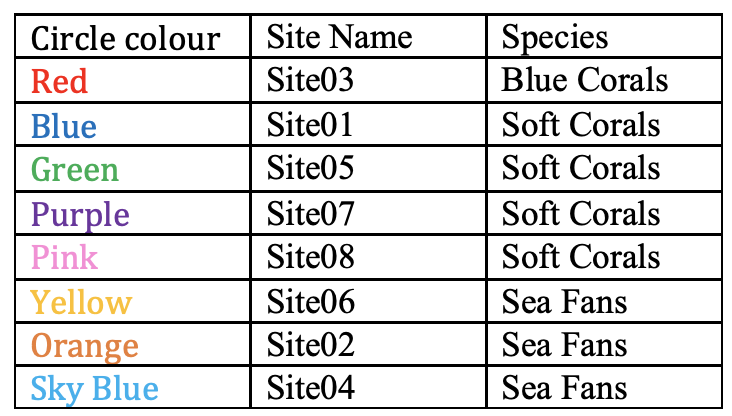
Below Figure 8 represents the average of bleaching for each species broken down by Sites. The graph is visualised based on data grouped by ‘name’, ‘longitude’, ‘latitude’, ‘species’ applied mean function. At the left side in Figure 8 shows that the highest bleaching value in each site. As the above table shows, site03 has the worst blue coral bleaching, and Site01,05,07 and 08 shows highest soft corals bleaching rate compare to other species. It seems the middle site of the Great Barrier Reefs affects to soft corals and more south site which is site 02 and 04 effects to Sea Fans.
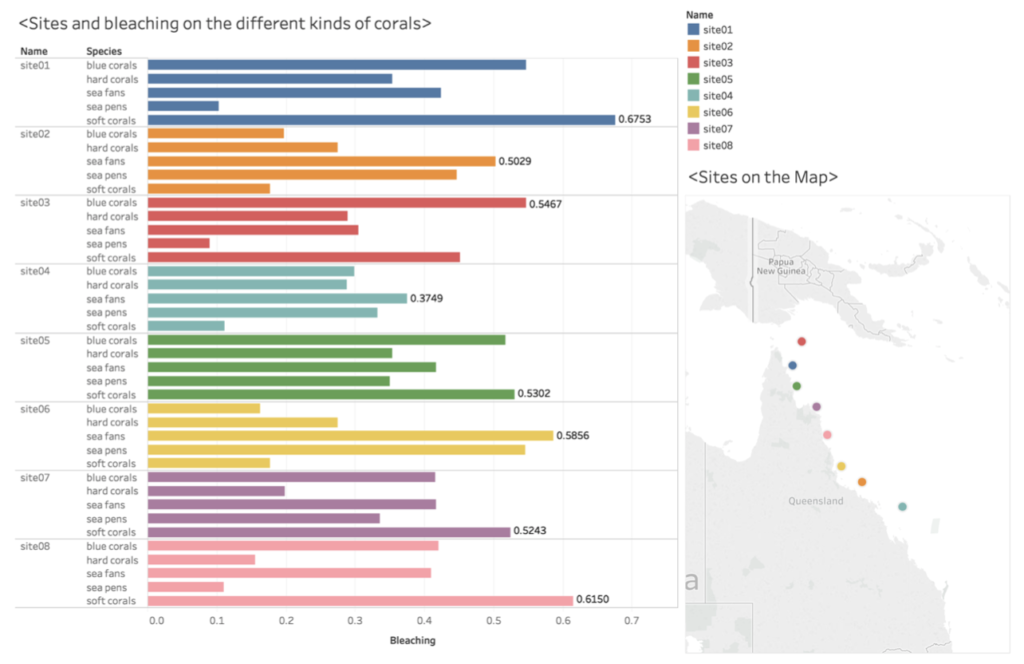
<Figure 8: The highest corals bleaching rate per site>
3. Summary
In this post, we completed data wrangling and data exploration by using Python and Tableau public tool. We have done data transformation to decrease the variability of data before performing data wrangling. In data wrangling, we have cleaned the data as finding outliers which were latitude and outranged bleaching and replaced missing values as referring by the average value of each bleaching values.
In order to answer the given questions, we were required to look the data in detail, so we used groupby() function to measure the average of each different category such as grouping name, species and year by bleaching contributed to answering question 1. From question 1, we recognised that Sea fans bleaching is the worst bleaching in 2017 over 8 years. From the question 2, we found that sites affect bleaching corals as site01, site05, site07, site08 shows the highest soft corals bleaching level compare to other kinds of corals. In addition, site06, site02, site04 shows the highest bleaching rate in sea fans over other kinds of corals.
Furthermore, we found an interesting topic in the result of the geography graph in Figure 8. The site04 which locates at the farthest away from the coast shows the lowest bleaching rate as 37% of sea fans. Thus, analysing “Does distance between coast and coral affect bleaching on the different kinds of coral” could be an interesting topic to be researched in further studies.

